
Showing posts with label Ambient media. Show all posts
Showing posts with label Ambient media. Show all posts
Thursday, 25 September 2008
Belvoir Fruit Farms
Absolutely gorgeous hand-lettered packaging for the Belvoir Fruit Farms range of cordials and pressés. The typography, color palette, and slightly worn look of the labels gives this product line a handmade look and feel that's completely sophisticated.

Wall:e keep britain tidy campagin
While working to town the other day I saw a poster about keeping britiain tidy. These have run for several years and never seem to actually work. However when i passed this one I thought it was very clever as its main iamge was of Wall:e of the lastest Disney Pixar film. This means it is kept up to date and also attracts a main targert audience of children. One of the more simple posters are shown below:

When i went to the corrisponding website it had this wall:e idea continuing out the campagin. It had the wall:e logo at the top of the page and even cuddly toy wall:e's to winners of the competitions that were being run. I feel this is a great way to get kids invovled in a serious issue.
When i went to the corrisponding website it had this wall:e idea continuing out the campagin. It had the wall:e logo at the top of the page and even cuddly toy wall:e's to winners of the competitions that were being run. I feel this is a great way to get kids invovled in a serious issue.
Friday, 29 August 2008
Park Lane college
Every time i walk to and from work i pass Park Lane College on burley road, when posters started to go up for the enrolment days i never really took much notice of them. However last weekend when we was extremely short staffed because of the annual Leeds festivial that was taking place i began to take more notice.

It was only during this that i relaized it was using the leeds fest to influence its design. Enrolement gets shorted to enrol and it even uses the worst fest. Adding on the date 08, also fits in with this design idea.
Using a up and coming well known event to help advertising your product is something that obviously works. This was also proven to me when i was looking up the winners of the student D&AD adwards, the winner of the Hamleys 250th anniversary brieft (the one i done) was someone who used the theme of olympics in there video. Olympics happened this year in China and are also coming to London in 2012.
The picture above used in this posting was taken from park lane's website however there was also posters, leflets and banners in the same style.
Wednesday, 27 August 2008
Guerrilla advertising
Guerrilla Advertising is an unconventional way of performing promotional activities. Usually very funny or subtle, it’s a great way to promote a business with a low budget and generate buzz. Below are some great examples.
 This advertisment is by FedEx, and is trying to show how quickly they can deliever, quick enough to help with a fire?
This is an advert for a casino in an airport, I think this makes the very boring and sometimes frustrating task of collecting luggage abit more fun and is almost certainly a talking point in the airport.

This advert is by mini copper and is about testing handling skills. It uses a play of words here and good use of location in which the advert wouldnt work otherwise.
These three adverts are great examples of guerrilla advertising. Although somepeople may say that advertising has got to much and that you cant escape it, i think these and fun and anything but boring, unlike many plain banners around you see. From these adverts i think that you can tell some of the key points in getting guerrilla advertising correct are placement of the advert and the text used.
Wednesday, 13 August 2008
Motivational Posters


Fun. Unique. Quirky. Thought provoking. I love this pictures. Espically the first one.
Friday, 8 August 2008
Becks
When we got the last delievery in at my pub, i couldnt help but notice that the labels on the becks bottles have changed to four diffenerent images, one is shown below:
 This completely puzzzled me. Why would they suddenly change a well reconzined brand label into something ocmpletelty differnet that dont even contain they name on and have four different images that dont even link together in any clear way. So i done some research on it.
There main aim is to start an initiative that gives promising contemporary artists the opportunity to exhibit their work in pubs, bars and off-licences across Britain. The brand, which has been fostering emerging artistic talent in the UK for more than 20 years, has linked up with the Royal College of Art (RCA) for the new initiative which will raise its retail profile in the months ahead.
A panel of judges from the prestigious College have selected four talented young artists who will have the unique opportunity to showcase their work on the labels of more than 27 million bottles of Beck’s (275ml) available to retailers in the on and off-trade from August.
The four successful Beck’s Canvas artists are:
• Riitta Ikonen, 27, who is studying a two year MA in Communication Art and Design at the Royal College of Arts and graduated last month.
• Tom Price, 26, is an alumni of Sculpture (2006) who received a First Class BA (Hons) Sculpture degree from Chelsea College of Art in 2004 and currently works from his Brixton studio.
• Simon Cunningham is an alumni of the MA Fine Art, photography course (2007) who lives and works in London.
• Charlotte Bracegirdle, 34, is an alumni of the Masters degree in painting (2006). Originally from Devon, Charlotte spent seven years applying to art schools across the UK before accepting a place at the RCA.
So what do becks get out of this? Well they believe, that the striking new labels that will be featured in a TV campaign for Beck’s to be run throughout August – will boost consumer awareness during a key trading period for retailers and that the introduction of new bottle labels will also have significant benefits for retailers. They believe the four new designs will stimulate the interest of pub-goers and shoppers and attract new consumers to the brand in the months ahead.
Will this actually be in case? I am not so sure, certainly in the last 2 weeks we have had these new deisgns in the pub i work in i havent recalled the sales in them going up, but maybe i will be better of judging this once august has gone and the ad campaign is in full swing as i personally havent seen a tv advert for these bottles yet. What do you think?
Monday, 28 July 2008
Ketchup
Below are three adverts that are currently being used by Heinz tomato ketchup:


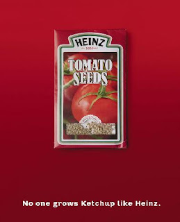 I first saw one of these adverts on a bus shelter. It was the second one. I took photo of it on my phone as a note to put it on my blog as it really caught my attention. Its fairly simple but clever. The tomato ketchup bottle is made out of slices of tomatos, i believe this is meant to represent the fact that ketchup is made of all natural ingredients, which is important in this day and age when people are really concerened with what they are eating. The background is a simple red which links in to the colour of the ketchup and the writing is white to make it stand out. The type face it kept simple so its clear and easy to read, and links in with this natural idea they are trying to get across. ' No one grows ketchup like Heinz' also links in well with this tone of voice.
The other two adverts i found on the internet when researching the first. The top one i think works really well with the tone of voice aswell, as its subtle at pointing the message across. However i dont think the last one works at all, it is far to obvious and doesnt fit in with the other two designs, when u look at them as a series it stands out and doesnt blend in well.
Friday, 18 July 2008
Summer of love and Pimms
I am currently working at a wetherspoons pub in Leeds. At the moment we are trying to sell our 'summer of love' theme where we are trying to push certain summer drinks. This whole camagine is delievered in a number of ways. Including posters around the pub, a display table in the pub, on the wetherspoons website and in the monthly wetherspoons magazine. The website is shown below:


All the ambient media follows the same theme as this website screen shot. The colour of every background is this light blue featuring a hint of clouds. This is typical of summer as it reminds the viewer of bright clean summer skys. The whole campagine with the typeface of the 'summer of love' title and all the bright flowers, has a very 60s feel to it.
This is because the Summer of Love refers to the summer of 1967, when an unprecedented gathering of as many as 100,000 young people converged on the Haight-Ashbury neighborhood of San Francissco, creating a phenomenon of cultural and political rebellion. While 'hippies' also gathered in New York, Los Angeles, Atlanta, Chicago, Vancouver, and across Europe, San Francisco was the epicenter of the hippie revolution, a melting pot of music, psychedelic drugs, sexual freedom, creative expression, and politics. The Summer of Love became a defining moment of the 1960s, as the hippie counterculture movement came into public awareness.
One of the main drinks that the pub is trying to sell is Pimms and lemonade, it is our 'focus drink' of the summer and we are trying to be pushed to sell as much as we can. This is reflected in the fact it is on the front cover on our june/july magazine, shown below:
 Agian on this magazine cover you can see the summer of love theme running through.
Pimms is a very well known summer drink, and it uses it advertising very well. Its very common to hear people saying the tag lines such as 'Its pimms o'clock' , 'ten of you one of me i make that pimms o'clock' or 'anyone for pimms' which was made famous by various advertising methods. The website for pimms follows through with this pimms summer theme aswell, shown below:
The background of the website is set in a park theme, you can see a couple blurred laying in the park, they have small movements like they are chatting but no movements to big to distract the viewer. In the right hand corner is a little note saying 'quite please' this is because the website has faint distance sounds of summer in the park, including noises like birds tweating and kids playing. This sets the scene really well. Links at the bottom of the screen include 'sunshine o'clock' and 'in the park'. As you first join the website home page the pimms pitcher is empty but this slowing fills while fruit like strawberrys roll across the scene, a common symbol of summer and things like wimbledon.
The famous pimms o'clock adverts which always end with the '?(a number) of you.....one of me.. i make that pimms o'clock' have been running now for several years. Alexander Armstrong plays the upper class twit with the picnic hamper containing his Pimm's mixing kit. He encounters a variety of different groups including motorway protesters, prostitutes, farmer workers and rave DJ's. One of the most popular adverts was one in a prison, shown below:
In this he is tunnelled into a prison, however the inmates jokingly tell them it's a Holiday Camp. In his usual brashness he has set up his travelling Pimm's case and is barbecuing sausages and making Pimm's for all, the party is ended when the Governor of the Prison chucks him and his case out.
The whole pimms series has been such as success supermarkets put Pimm's and punnets of strawberries on special offer together, and 80,000 half pints are served at Wimbledon every year, closely trailed by race meetings at Royal Ascot, Goodwood and boating at Henley.Also if you're feeling lazy or going on a picnic you can now buy pre-mixed Pimm's No 1 in can form. It is proberly one of the most successful advertising camagines in recent times.
Wednesday, 9 July 2008
Chocolat Factory
While looking at other peoples glogs i came accross one (http://cerbear07.blogspot.com/) that had a link to this website http://www.chocolatfactory.com/ and although she commented on its work slightly i felt it could be taken further so i decided to check out the site myself.
The Website

This is the homepage to the actual website, it using a dark background for greater impact with white writing to stand out. The three cicrcles on the right hand side have permant colours in, the others get filled with colours when the mouse moves over it. The colours are all dark browns and beige which relate to the chocolate the company is trying to sell.

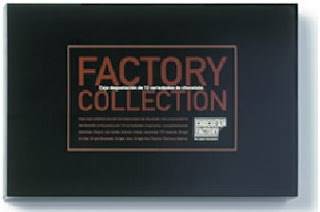 Both of these products one many awards. including Best packaging design2000, Barcelona, Fab awards 2001, London, and Award of Excellence Communication Arts 2001, California. Both packaging are simple but effective. You can also see the link between these designs and the design of the website. Again it has the strong black background for a big impact, this would definatly stand out. It again has the brown chocolatly colour that gives the target market a clue to what the product is actually selling. It also uses the white writing in corrosponding strips in the centre to make the writing stand out.
The Website
This is the homepage to the actual website, it using a dark background for greater impact with white writing to stand out. The three cicrcles on the right hand side have permant colours in, the others get filled with colours when the mouse moves over it. The colours are all dark browns and beige which relate to the chocolate the company is trying to sell.
The products
Both of these products one many awards. including Best packaging design2000, Barcelona, Fab awards 2001, London, and Award of Excellence Communication Arts 2001, California. Both packaging are simple but effective. You can also see the link between these designs and the design of the website. Again it has the strong black background for a big impact, this would definatly stand out. It again has the brown chocolatly colour that gives the target market a clue to what the product is actually selling. It also uses the white writing in corrosponding strips in the centre to make the writing stand out. Tuesday, 8 July 2008
Club flyers - Play on words
I love s.e.x is a student night in Leeds. It has been running for about three years and in this time it has moved from Evolution nightclub, to NU Bar and is currently being held in Bajas. Although it has had several homes, the advertising for this night club has remained similar, shown below.


The name of the student night is a pun, its a play on words as s.e.x actually stands for Saturday Evolution Experience, or Saturday Entertainment Experience, therefore its also very tongue-in-cheek. Doing this grabs peoples (espically students) attention who may be walking past posters or given leaflets on the streets which is the main ways this sort of night is currently advertised.
Keeping the name and layout the same makes it instantly recongizable to people who are already familiar with and like the night so they keep the same customers while still gaining new ones.
Subscribe to:
Posts (Atom)