Friday, 29 August 2008

Absolut vodka

I loved this website almost as much as i love the vodka its self. It was easy to navigate around with changing flip pages like on the new windows vista. Although you had to be 21 to get in the site you could easily lie like i infact did. Below are some print screens of the website.


Harry Potter

I dont care weather it makes me sound sad or like a big kid, i love the harry potter books (not films only books) They are fun to read, you can get lost in them, and the story is so complex with so many interwinning plot lines that you might not pick up on on ure first read or untill you have read all the books. I also think they are good because they have got kids reading again!


Harry Potter is a series of seven fantasy novels written by British author J. K. Rowling. The books chronicle the adventures of the eponymous adolescent wizard Harry Potter, together with Ron Weasley and Hermione Granger, his friends from the Hogwarts School of Witchcraft and Wizardry. The central story arc concerns Harry's struggle against the evil wizard Lord Voldemort, who killed Harry's parents in his quest to conquer the wizarding world, after which he seeks to subjugate the Muggle (non-magical) world to his rule. The stories have inspired films, video games and other themed merchandise.


There are two types of book covers you can get, adult versions and kids versions.


It clear from these to tell which is which. The kids versions are alot brighter containg more colours and more fun light-hearted images. The adult books are all set with a black background with images that are slightly more intreging and thought provoking. Having to have two sets of designs shows how popular harry potter is with all ages.

Park Lane college

Every time i walk to and from work i pass Park Lane College on burley road, when posters started to go up for the enrolment days i never really took much notice of them. However last weekend when we was extremely short staffed because of the annual Leeds festivial that was taking place i began to take more notice.

It was only during this that i relaized it was using the leeds fest to influence its design. Enrolement gets shorted to enrol and it even uses the worst fest. Adding on the date 08, also fits in with this design idea.
Using a up and coming well known event to help advertising your product is something that obviously works. This was also proven to me when i was looking up the winners of the student D&AD adwards, the winner of the Hamleys 250th anniversary brieft (the one i done) was someone who used the theme of olympics in there video. Olympics happened this year in China and are also coming to London in 2012.
The picture above used in this posting was taken from park lane's website however there was also posters, leflets and banners in the same style.

Wall:e

I loved this film! However perhaps if i new before i went that they was no speaking for the first half hour or so before i went i wouldnt of even gone let alone seen it!


The film starts silent (ie no talking) with you watching Wall-E trundle round doing his job enjoying the company of his best friend, a cockroach. There is no speaking, yet you can instantly empathise with this tiny little, very lonely, robot. He works hard at his job, and he has too since he’s the only “person” left on the planet.

However his peaceful, albeit lonely, life is soon interrupted by the sexy Eve - a robot on a mission - deposited on earth by a massive space ship. Initially she refuses his silent advances - then just as she’s softening towards him she finds what she’s looking for and goes totally quiet - and then the real story begins.

Having no talking in a Pixar film is a new concept and one that i thought was very risky, however it certainly pays off! A fab film and the best to date!

Wednesday, 27 August 2008

Guerrilla advertising

Guerrilla Advertising is an unconventional way of performing promotional activities. Usually very funny or subtle, it’s a great way to promote a business with a low budget and generate buzz. Below are some great examples.
This advertisment is by FedEx, and is trying to show how quickly they can deliever, quick enough to help with a fire?

This is an advert for a casino in an airport, I think this makes the very boring and sometimes frustrating task of collecting luggage abit more fun and is almost certainly a talking point in the airport.

This advert is by mini copper and is about testing handling skills. It uses a play of words here and good use of location in which the advert wouldnt work otherwise.

These three adverts are great examples of guerrilla advertising. Although somepeople may say that advertising has got to much and that you cant escape it, i think these and fun and anything but boring, unlike many plain banners around you see. From these adverts i think that you can tell some of the key points in getting guerrilla advertising correct are placement of the advert and the text used.

Tuesday, 26 August 2008

Good things should never end

Orange 'umlimited' website


The whole idea of making the website more interactive engages the user and differentiates itself from its competitors. The challenge for companies now it seems is to create a website that offers much more and keeps you interested, I think this website succeeds in doing this. The sight was even recognised in the D&AD Awards, http://www.dandad.org/awards08/entry.asp?entry_id=24629

New moon

This book new moon is one i have just finished reading, below is the front cover:


I had never heard of this author before, so what made me book up the book from the other hundreds on the selves? Well i liked the strong dark backgorund that made it stand out with the very simple image. The image wouldnt actually tell you anything anbout the book which made it more intreguing and made me want to read the back. I also like the fact that unlike most books the title wasnt the most dominate thing on the page. Infact the title has a simple type face and is fairly small in the top right of the book, this shows that the author is letting the image do the talking and be powerful enough.

When therefore i started to research other books by the author (stephenie Meyer) i found that this style was a running them through her work and that it gives her an identity. Followers of her would be able to instantly recongize her books. Another two of Stephenies books are shown below:


Thursday, 21 August 2008

10 things i hate about you

I know its sad, but i love this film! Its girly, Romantic, and predictable - but i still cant stop myself from watching it.


10 Things I Hate About You is a 1999 American romantic comedy film. It is directed by Gil Junger and stars Heath Ledger, Julia Stiles, Joseph Gordon-Levitt, Larisa Oleynik, David Krumholtz and Larry Miller. A loose adaptation of Shakespeare's The Taming of the Shrew set in a modern American high school, the screenplay was written by Karen McCullah Lutz and Kirsten Smith. The movie's title is a twist on The Taming of the Shrew (see below) but is also a reference to a poem written by the film's female lead to describe her bittersweet romance with the male lead. The film was released March 31, 1999, and it was a breakout success for stars Stiles and Ledger. The film marks the directing debut of Junger, as well as the screenplay debut for Lutz and Smith. Lutz and Smith later wrote the screenplay for a second Shakespeare teen comedy, She's the Man.

Tuesday, 19 August 2008

Tate Modern

Tate Modern has unveiled plans for a tall extension on its south side increasing the modern art gallery's overall size by more than half. A picture of the proposed extension is shown below:

The new glass building, on part of the southwest lawn, will rise above the existing main brick structure and be visible from the City.

The architects are Herzog & de Meuron who converted Bankside Power Station into Tate Modern. The cost of the new building is £165 million at today's prices and the Tate will be seeking both Lottery and private funding. It is estimated that the final bill could be £215 million.

There will be new performance areas, a 400 seat auditorium, new flexible exhibition space and more room for the pioneering education service. A public roof terrace and a tenth floor restaurant will provide panoramic views both north and south.

I have viistd the tate many times, as going to school in london and doing art it was the place to go for school trips, and while i was there i was never very impressed with the outside as i always thought it looked like an old disused run-down building, so hopefully this new extension will give it the twist i believe it so desperatly needs!

Cobra, Kuwait

The cobra towers is meant to be a unique new building coming to kuwait, I thought it was brillaint when i first saw the pictures however since resarching it more on th internet, there is actually very little information on it and some people are even saying it is a hoax.


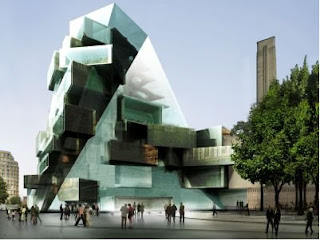
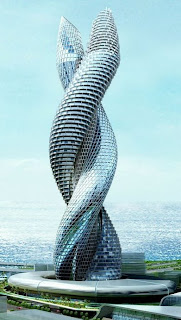
What Kuwait needs is an icon that will put it on the global map, or so says Neville Purchase, General Manager for Atkins Middle East. He argues that Kuwait needs a building "that can be put on your number plate. A job that's worthy of national recognition. This needs to be something that people accept as an icon for their country.
I certainly think the cobra would do inexactly that!

Water Cube

I love the olympics! And what with them being everywhere at the moment it is hard to ignore and of the news. One of the buildings that caught my eye strveaight away is the water cube where swimming events are being held. Blow are pictures of the water cube.


The material of membrane structure is called ETFE, or ethylene-tetra-fluoro-ethylene, used for the first time in China. It is also the largest and most complicated membrane system in a single building project internationally. The construction staff of the National Aquatics Center completed all works and fulfilled the goal as planned after overcoming many difficulties, successfully carrying out membrane structure research and independent innovative construction practice.

Wednesday, 13 August 2008

Motivational Posters


Fun. Unique. Quirky. Thought provoking. I love this pictures. Espically the first one.

Monday, 11 August 2008

Bottlemania

Elizabeth Royte’s Bottlemania: How Water Went on Sale and Why We Bought It provides a succinct history of bottled water and how it came to be a force in the beverage industry. She also fully explores the social, political, and ecological connotations of drinking water from a bottle. This quest is set against the backdrop of a battle between Poland Spring and Fryeburg, a Maine town whose water fills the company’s bottles. Royte shows us that complicated water issues are not only unfolding in parched western states, and that water-use laws will only grow in significance as clean sources dry up. After exploring the privatizing of a resource that has traditionally been publicly managed in the U.S., the author draws her own conclusions. Instead of succumbing to clever marketing, buying pretty labels or trying to be hip, she says her water decisions will reflect the understanding that bottled water is an unnecessary indulgence that’s contributing to the major social and environmental problems of our time.

The actually book cover is quite clever and intresting aswell. Teh name of the book it fit into a bottle shape which makes up the image and the background is of water bubbles. Quite celver.

Friday, 8 August 2008

Becks

When we got the last delievery in at my pub, i couldnt help but notice that the labels on the becks bottles have changed to four diffenerent images, one is shown below:


This completely puzzzled me. Why would they suddenly change a well reconzined brand label into something ocmpletelty differnet that dont even contain they name on and have four different images that dont even link together in any clear way. So i done some research on it.

There main aim is to start an initiative that gives promising contemporary artists the opportunity to exhibit their work in pubs, bars and off-licences across Britain. The brand, which has been fostering emerging artistic talent in the UK for more than 20 years, has linked up with the Royal College of Art (RCA) for the new initiative which will raise its retail profile in the months ahead.

A panel of judges from the prestigious College have selected four talented young artists who will have the unique opportunity to showcase their work on the labels of more than 27 million bottles of Beck’s (275ml) available to retailers in the on and off-trade from August.

The four successful Beck’s Canvas artists are:
• Riitta Ikonen, 27, who is studying a two year MA in Communication Art and Design at the Royal College of Arts and graduated last month.
• Tom Price, 26, is an alumni of Sculpture (2006) who received a First Class BA (Hons) Sculpture degree from Chelsea College of Art in 2004 and currently works from his Brixton studio.
• Simon Cunningham is an alumni of the MA Fine Art, photography course (2007) who lives and works in London.
• Charlotte Bracegirdle, 34, is an alumni of the Masters degree in painting (2006). Originally from Devon, Charlotte spent seven years applying to art schools across the UK before accepting a place at the RCA.

So what do becks get out of this? Well they believe, that the striking new labels that will be featured in a TV campaign for Beck’s to be run throughout August – will boost consumer awareness during a key trading period for retailers and that the introduction of new bottle labels will also have significant benefits for retailers. They believe the four new designs will stimulate the interest of pub-goers and shoppers and attract new consumers to the brand in the months ahead.

Will this actually be in case? I am not so sure, certainly in the last 2 weeks we have had these new deisgns in the pub i work in i havent recalled the sales in them going up, but maybe i will be better of judging this once august has gone and the ad campaign is in full swing as i personally havent seen a tv advert for these bottles yet. What do you think?