
Thursday, 25 September 2008
Belvoir Fruit Farms
Absolutely gorgeous hand-lettered packaging for the Belvoir Fruit Farms range of cordials and pressés. The typography, color palette, and slightly worn look of the labels gives this product line a handmade look and feel that's completely sophisticated.
Wall:e keep britain tidy campagin
While working to town the other day I saw a poster about keeping britiain tidy. These have run for several years and never seem to actually work. However when i passed this one I thought it was very clever as its main iamge was of Wall:e of the lastest Disney Pixar film. This means it is kept up to date and also attracts a main targert audience of children. One of the more simple posters are shown below:

When i went to the corrisponding website it had this wall:e idea continuing out the campagin. It had the wall:e logo at the top of the page and even cuddly toy wall:e's to winners of the competitions that were being run. I feel this is a great way to get kids invovled in a serious issue.
When i went to the corrisponding website it had this wall:e idea continuing out the campagin. It had the wall:e logo at the top of the page and even cuddly toy wall:e's to winners of the competitions that were being run. I feel this is a great way to get kids invovled in a serious issue.
Mona Lisa Book covers
There have been a variety of book covers which uses the very famous image of the Mona Lisa in a new twist. Examples are shown below:


The famous cover of New Yorker Magazine depicting Monica Lewinsky as the Mona Lisa (above). This clever and attractive image plays on multiple characteristics of its subject: Monica was known among friends as "Mona," The images of her in the popular press emphasized her mouth and smile (with appropriate innuendo), and in both Monica and Mona there flies the uncertainty of the nature of her relationship with a great celebrity.
Wednesday, 24 September 2008
New facebook
There has recently been a change in the facebook layout style. I like it however most people really hate it. There are so many groups i keep getting invited to about bring back the new facebook, so why do i like the new one?
I think its is more asthetically pleasing, i find it much easier to find out whats going on, the layout is more simple and coherant to read, and also when ure visiting someone elses profile you dont have to scroll all the way for about 10 mins to there wall cause of the amount of crap applications they have decided to have!
What do you think? old or new?
Food adverts
I am doing my dissertation on food adverts aimed at children and weatehr it has influenced them and has helped cause the growing obesity rate this country is in at the momement. This short video shows a handful of adverts aimed at children and are some i will be studing. What do you think on the topic?
Banned Pepsi advert
I love this advert! I prefer Coca-Cola but I thought the advert was quite amusing.And in all honesty that boy would've made Coca-Cola money so everybody wins!
Tuesday, 23 September 2008
Stepfod Wives
I dont know if i should be wrtiting this on my blog as its not 'inspirational' and certainly doesnt make me 'tick' in any way, but i ahte to write about it to try and warn people NEVER to see this film! It is soooooooo boring and long its the only film i have walked out in a cinema on and has got to be one of the worst films of all time!!!!!

Monday, 22 September 2008
Moulin Rouge

Moulin Rouge! is a 2001 musical film directed by Baz Luhrmann, based largely on the Giuseppe Verdi opera La Traviata. It tells the story of a young British poet/writer, Christian, who falls in love with the star of the Moulin Rouge, cabaret actress and courtesan Satine, played by Ewan McGregor and Nicole Kidman, respectively. It uses the musical setting of the Montmartre Quarter of Paris, France. The film was nominated for eight Oscars, including Best Picture and won two: for art direction and costume design. It was shot at Fox Studios in Sydney, Australia.
In 2006, Moulin Rouge! ranked twenty-fifth on the American Film Institute's list of best musicals. And i can certainly tell why! This film is heart-wrenching and the design is amazing! No wonder it won an oscar for costume design - fab!
Kelvingrove Art Gallery and Museum
While in glasgow i also visited kelvingrove Art Gallery and museum. Kelvingrove’s annual total of one million visits made it in absolute terms the most-visited museum in Scotland, and the sixth most-visited museum in Britain. And i could totally see why!
For generations of people from Glasgow and the surrounding neighbourhoods, it has a deep, personal significance linked with every stage of their lives. Visits to ‘the art galleries’ are highlights of childhood memories; many people did their courting there; parenthood and grandparenthood see the cycle begin again. It is also a stunnning building to look at.

Lucy Skaer
Another artist that grabbed my attention at the gallery in Glasgow was Lucy Skaer.
Skaer's drawings utilise found imagery sourced from photojournalistic reportage. Working on paper - large stretches that in scale resemble unfurled banners, flags or giant scrolls, typically, the main substance of her drawings is graphite to which she adds enamel paint, ink and gold leaf. The paper she works on is often so big she has them laid out on the floor.
By merging photo-orientated images with different forms of patterning, Skaer creates shifting collages that, once distanced from their original source, become open to alternative interpretations. This is what caught my attention, as I was trying to work out what the drawings where. Below are two photos I took of one of her drawings. One is a close up on the other.


Jim Lambie
While in Glasgow I visited the Gallery of Modern Art. The main exhibition that was on was called forever changes and was by an artist called Jim Lambie.
Lambie was born in 1964 in Glasgow, and is a contemporary visual artist. He was shortlisted for the 2005 Turner Prize with an installation called Mental Oyster. Lambie specialises in colourful sculptural installations made from everyday modern materials including pop culture objects, such as posters and album covers, and household accessories. The other trademark theme in his artistic practice is using brightly coloured vinyl tape arranged into patterns around the floor of the gallery space, tracing the shape of the room to reveal the idiosyncrasies of its architecture.
The forever changes exhibition I saw was no different. One of the main art pieces were concreate slabs sticking out of the floor with the side of vinyl covers stuck to them, 100s on each. However although I wasn’t majorly impressed with his art pieces (as I am not a lover of modern art) his designed floor for the gallery was amazing. Below are some pictures of the floors he has created in gallerys around the world.


Edinburgh Castle
I recently went on a two week holiday to Scotland, hence why there hasn’t been posts for a while. I saw many wonderful designs here and the next few posts will be a some of them that I have chosen to put on here.

The main thing I couldn’t ignore while I was in Edinburgh was the magnificant castle. Human habitation of the castle is dated back as far as the 9th century BC. As it stands today though, few of the castle's structures pre-date the Lang Siege of the 16th century, with the notable exception of St. Margarets chapel, the oldest surviving building in Edinburgh, which dates from the early 12th century. The city centre is overlooked by the castle and you can just imagine the history that went on there. The castle is definatly the must see of Edinburgh. Below is a picture of the castle:
As with all castles, Edinburgh's fortress has been a centre of military activity. As an ancient fortress, Edinburgh Castle is one of the few that still has a military garrison, albeit for largely ceremonial and administrative purposes. The New Barrack Block is now home to the official headquarters of the Royal regiment of Scotland and 52 Infantry Brigade, as well as home to the regimental museum of the Royal Scots and Royal Scots Dragoon Guards. The Governor of Edinburgh Castle is Major General David MacDowall, GOC of the British Army's 2nd Division. The Governor of the Castle has always been the head of the Army in Scotland. Direct administration of the castle by the War Office only came to an end in 1923 when the army formally moved to the city's new Redford Barracks. Nevertheless, the Castle continues to have a strong connection with the Army. Sentries still stand watch at the castle gatehouse after opening hours, with responsibility for guarding the Honours of Scotland.
Here are a couple of intresting facts about the castle I found while on a tour of the site and thought might be intresting:
In August 1830, some bones of a child, a fragment of cloth and pieces of wood were discovered in a wall in the Royal Palace. The cloth bore the letter ‘J’. Within 50 years, fertile imaginations had created the myth that the baby born to Mary Queen of Scots in 1566 had been still-born; and that the boy believed to be her son was a surrogate!
In February 1720, 21 pirates, captured in Argyll with their ship Eagle, were thrown into the castle dungeons. They had all previously sailed with one of the most infamous pirate-captains of the Caribbean, Bartholomew ‘Black Bart’ Roberts. Most were ‘hanged by the neck upon the gibbet’ on Leith Sands nine months later.
Friday, 29 August 2008
Absolut vodka
I loved this website almost as much as i love the vodka its self. It was easy to navigate around with changing flip pages like on the new windows vista. Although you had to be 21 to get in the site you could easily lie like i infact did. Below are some print screens of the website.

Harry Potter
I dont care weather it makes me sound sad or like a big kid, i love the harry potter books (not films only books) They are fun to read, you can get lost in them, and the story is so complex with so many interwinning plot lines that you might not pick up on on ure first read or untill you have read all the books. I also think they are good because they have got kids reading again!
Harry Potter is a series of seven fantasy novels written by British author J. K. Rowling. The books chronicle the adventures of the eponymous adolescent wizard Harry Potter, together with Ron Weasley and Hermione Granger, his friends from the Hogwarts School of Witchcraft and Wizardry. The central story arc concerns Harry's struggle against the evil wizard Lord Voldemort, who killed Harry's parents in his quest to conquer the wizarding world, after which he seeks to subjugate the Muggle (non-magical) world to his rule. The stories have inspired films, video games and other themed merchandise.
There are two types of book covers you can get, adult versions and kids versions.


It clear from these to tell which is which. The kids versions are alot brighter containg more colours and more fun light-hearted images. The adult books are all set with a black background with images that are slightly more intreging and thought provoking. Having to have two sets of designs shows how popular harry potter is with all ages.
Park Lane college
Every time i walk to and from work i pass Park Lane College on burley road, when posters started to go up for the enrolment days i never really took much notice of them. However last weekend when we was extremely short staffed because of the annual Leeds festivial that was taking place i began to take more notice.

It was only during this that i relaized it was using the leeds fest to influence its design. Enrolement gets shorted to enrol and it even uses the worst fest. Adding on the date 08, also fits in with this design idea.
Using a up and coming well known event to help advertising your product is something that obviously works. This was also proven to me when i was looking up the winners of the student D&AD adwards, the winner of the Hamleys 250th anniversary brieft (the one i done) was someone who used the theme of olympics in there video. Olympics happened this year in China and are also coming to London in 2012.
The picture above used in this posting was taken from park lane's website however there was also posters, leflets and banners in the same style.
Wall:e
I loved this film! However perhaps if i new before i went that they was no speaking for the first half hour or so before i went i wouldnt of even gone let alone seen it!

The film starts silent (ie no talking) with you watching Wall-E trundle round doing his job enjoying the company of his best friend, a cockroach. There is no speaking, yet you can instantly empathise with this tiny little, very lonely, robot. He works hard at his job, and he has too since he’s the only “person” left on the planet.
However his peaceful, albeit lonely, life is soon interrupted by the sexy Eve - a robot on a mission - deposited on earth by a massive space ship. Initially she refuses his silent advances - then just as she’s softening towards him she finds what she’s looking for and goes totally quiet - and then the real story begins.
Having no talking in a Pixar film is a new concept and one that i thought was very risky, however it certainly pays off! A fab film and the best to date!
Wednesday, 27 August 2008
Guerrilla advertising
Guerrilla Advertising is an unconventional way of performing promotional activities. Usually very funny or subtle, it’s a great way to promote a business with a low budget and generate buzz. Below are some great examples.
 This advertisment is by FedEx, and is trying to show how quickly they can deliever, quick enough to help with a fire?
This advertisment is by FedEx, and is trying to show how quickly they can deliever, quick enough to help with a fire?
This is an advert for a casino in an airport, I think this makes the very boring and sometimes frustrating task of collecting luggage abit more fun and is almost certainly a talking point in the airport.

This advert is by mini copper and is about testing handling skills. It uses a play of words here and good use of location in which the advert wouldnt work otherwise.
These three adverts are great examples of guerrilla advertising. Although somepeople may say that advertising has got to much and that you cant escape it, i think these and fun and anything but boring, unlike many plain banners around you see. From these adverts i think that you can tell some of the key points in getting guerrilla advertising correct are placement of the advert and the text used.
Tuesday, 26 August 2008
Good things should never end
Orange 'umlimited' website


The whole idea of making the website more interactive engages the user and differentiates itself from its competitors. The challenge for companies now it seems is to create a website that offers much more and keeps you interested, I think this website succeeds in doing this. The sight was even recognised in the D&AD Awards, http://www.dandad.org/awards08/entry.asp?entry_id=24629
New moon
This book new moon is one i have just finished reading, below is the front cover:

I had never heard of this author before, so what made me book up the book from the other hundreds on the selves? Well i liked the strong dark backgorund that made it stand out with the very simple image. The image wouldnt actually tell you anything anbout the book which made it more intreguing and made me want to read the back. I also like the fact that unlike most books the title wasnt the most dominate thing on the page. Infact the title has a simple type face and is fairly small in the top right of the book, this shows that the author is letting the image do the talking and be powerful enough.
I had never heard of this author before, so what made me book up the book from the other hundreds on the selves? Well i liked the strong dark backgorund that made it stand out with the very simple image. The image wouldnt actually tell you anything anbout the book which made it more intreguing and made me want to read the back. I also like the fact that unlike most books the title wasnt the most dominate thing on the page. Infact the title has a simple type face and is fairly small in the top right of the book, this shows that the author is letting the image do the talking and be powerful enough.


Thursday, 21 August 2008
10 things i hate about you
I know its sad, but i love this film! Its girly, Romantic, and predictable - but i still cant stop myself from watching it.

10 Things I Hate About You is a 1999 American romantic comedy film. It is directed by Gil Junger and stars Heath Ledger, Julia Stiles, Joseph Gordon-Levitt, Larisa Oleynik, David Krumholtz and Larry Miller. A loose adaptation of Shakespeare's The Taming of the Shrew set in a modern American high school, the screenplay was written by Karen McCullah Lutz and Kirsten Smith. The movie's title is a twist on The Taming of the Shrew (see below) but is also a reference to a poem written by the film's female lead to describe her bittersweet romance with the male lead. The film was released March 31, 1999, and it was a breakout success for stars Stiles and Ledger. The film marks the directing debut of Junger, as well as the screenplay debut for Lutz and Smith. Lutz and Smith later wrote the screenplay for a second Shakespeare teen comedy, She's the Man.
Tuesday, 19 August 2008
Tate Modern
Tate Modern has unveiled plans for a tall extension on its south side increasing the modern art gallery's overall size by more than half. A picture of the proposed extension is shown below:
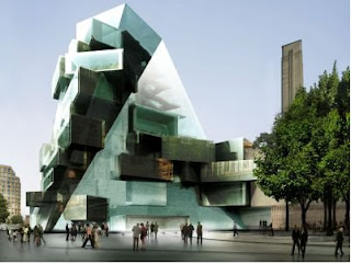
The new glass building, on part of the southwest lawn, will rise above the existing main brick structure and be visible from the City.
The architects are Herzog & de Meuron who converted Bankside Power Station into Tate Modern. The cost of the new building is £165 million at today's prices and the Tate will be seeking both Lottery and private funding. It is estimated that the final bill could be £215 million.
There will be new performance areas, a 400 seat auditorium, new flexible exhibition space and more room for the pioneering education service. A public roof terrace and a tenth floor restaurant will provide panoramic views both north and south.
I have viistd the tate many times, as going to school in london and doing art it was the place to go for school trips, and while i was there i was never very impressed with the outside as i always thought it looked like an old disused run-down building, so hopefully this new extension will give it the twist i believe it so desperatly needs!
Cobra, Kuwait
The cobra towers is meant to be a unique new building coming to kuwait, I thought it was brillaint when i first saw the pictures however since resarching it more on th internet, there is actually very little information on it and some people are even saying it is a hoax.
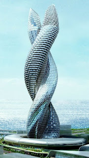
 What Kuwait needs is an icon that will put it on the global map, or so says Neville Purchase, General Manager for Atkins Middle East. He argues that Kuwait needs a building "that can be put on your number plate. A job that's worthy of national recognition. This needs to be something that people accept as an icon for their country.
What Kuwait needs is an icon that will put it on the global map, or so says Neville Purchase, General Manager for Atkins Middle East. He argues that Kuwait needs a building "that can be put on your number plate. A job that's worthy of national recognition. This needs to be something that people accept as an icon for their country.I certainly think the cobra would do inexactly that!
Water Cube
I love the olympics! And what with them being everywhere at the moment it is hard to ignore and of the news. One of the buildings that caught my eye strveaight away is the water cube where swimming events are being held. Blow are pictures of the water cube.


The material of membrane structure is called ETFE, or ethylene-tetra-fluoro-ethylene, used for the first time in China. It is also the largest and most complicated membrane system in a single building project internationally. The construction staff of the National Aquatics Center completed all works and fulfilled the goal as planned after overcoming many difficulties, successfully carrying out membrane structure research and independent innovative construction practice.
Wednesday, 13 August 2008
Motivational Posters


Fun. Unique. Quirky. Thought provoking. I love this pictures. Espically the first one.
Monday, 11 August 2008
Bottlemania
 Elizabeth Royte’s Bottlemania: How Water Went on Sale and Why We Bought It provides a succinct history of bottled water and how it came to be a force in the beverage industry. She also fully explores the social, political, and ecological connotations of drinking water from a bottle. This quest is set against the backdrop of a battle between Poland Spring and Fryeburg, a Maine town whose water fills the company’s bottles. Royte shows us that complicated water issues are not only unfolding in parched western states, and that water-use laws will only grow in significance as clean sources dry up. After exploring the privatizing of a resource that has traditionally been publicly managed in the U.S., the author draws her own conclusions. Instead of succumbing to clever marketing, buying pretty labels or trying to be hip, she says her water decisions will reflect the understanding that bottled water is an unnecessary indulgence that’s contributing to the major social and environmental problems of our time.
The actually book cover is quite clever and intresting aswell. Teh name of the book it fit into a bottle shape which makes up the image and the background is of water bubbles. Quite celver.
Friday, 8 August 2008
Becks
When we got the last delievery in at my pub, i couldnt help but notice that the labels on the becks bottles have changed to four diffenerent images, one is shown below:
 This completely puzzzled me. Why would they suddenly change a well reconzined brand label into something ocmpletelty differnet that dont even contain they name on and have four different images that dont even link together in any clear way. So i done some research on it.
There main aim is to start an initiative that gives promising contemporary artists the opportunity to exhibit their work in pubs, bars and off-licences across Britain. The brand, which has been fostering emerging artistic talent in the UK for more than 20 years, has linked up with the Royal College of Art (RCA) for the new initiative which will raise its retail profile in the months ahead.
A panel of judges from the prestigious College have selected four talented young artists who will have the unique opportunity to showcase their work on the labels of more than 27 million bottles of Beck’s (275ml) available to retailers in the on and off-trade from August.
The four successful Beck’s Canvas artists are:
• Riitta Ikonen, 27, who is studying a two year MA in Communication Art and Design at the Royal College of Arts and graduated last month.
• Tom Price, 26, is an alumni of Sculpture (2006) who received a First Class BA (Hons) Sculpture degree from Chelsea College of Art in 2004 and currently works from his Brixton studio.
• Simon Cunningham is an alumni of the MA Fine Art, photography course (2007) who lives and works in London.
• Charlotte Bracegirdle, 34, is an alumni of the Masters degree in painting (2006). Originally from Devon, Charlotte spent seven years applying to art schools across the UK before accepting a place at the RCA.
So what do becks get out of this? Well they believe, that the striking new labels that will be featured in a TV campaign for Beck’s to be run throughout August – will boost consumer awareness during a key trading period for retailers and that the introduction of new bottle labels will also have significant benefits for retailers. They believe the four new designs will stimulate the interest of pub-goers and shoppers and attract new consumers to the brand in the months ahead.
Will this actually be in case? I am not so sure, certainly in the last 2 weeks we have had these new deisgns in the pub i work in i havent recalled the sales in them going up, but maybe i will be better of judging this once august has gone and the ad campaign is in full swing as i personally havent seen a tv advert for these bottles yet. What do you think?
Monday, 28 July 2008
Ketchup
Below are three adverts that are currently being used by Heinz tomato ketchup:


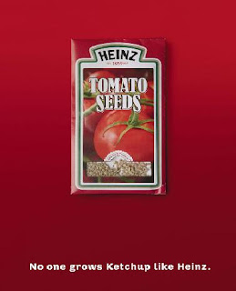 I first saw one of these adverts on a bus shelter. It was the second one. I took photo of it on my phone as a note to put it on my blog as it really caught my attention. Its fairly simple but clever. The tomato ketchup bottle is made out of slices of tomatos, i believe this is meant to represent the fact that ketchup is made of all natural ingredients, which is important in this day and age when people are really concerened with what they are eating. The background is a simple red which links in to the colour of the ketchup and the writing is white to make it stand out. The type face it kept simple so its clear and easy to read, and links in with this natural idea they are trying to get across. ' No one grows ketchup like Heinz' also links in well with this tone of voice.
I first saw one of these adverts on a bus shelter. It was the second one. I took photo of it on my phone as a note to put it on my blog as it really caught my attention. Its fairly simple but clever. The tomato ketchup bottle is made out of slices of tomatos, i believe this is meant to represent the fact that ketchup is made of all natural ingredients, which is important in this day and age when people are really concerened with what they are eating. The background is a simple red which links in to the colour of the ketchup and the writing is white to make it stand out. The type face it kept simple so its clear and easy to read, and links in with this natural idea they are trying to get across. ' No one grows ketchup like Heinz' also links in well with this tone of voice.
The other two adverts i found on the internet when researching the first. The top one i think works really well with the tone of voice aswell, as its subtle at pointing the message across. However i dont think the last one works at all, it is far to obvious and doesnt fit in with the other two designs, when u look at them as a series it stands out and doesnt blend in well.
James Downing
James is a friend of mine and is a local artist. He specializes in illustrations, he advertises his work on a website called http://www.couk-art.co.uk/. His home page represents his work very well, shown below:


The page is set out like a book or diary, the left hand side describes who he is and the right allows you to click on other links. The reason it reflects his style so well is that its all hand drawn and looks like sketches or doddles, this is his style. Another reason i like his work is there is no p.c and he gets straight to the point without being posh. An example of this is shown in the writing in this home page where he writes 'where you can see how ruddy amazing my illustrations are.'
Another good example of this and his main work that i really like is his 'clog' which is a comic blog. Its called suede diary. Instead of writing a normal diary in his blog he writes about his day to day life in cartoon form, most of which are very funny, shown below:
I am even in one of these cartoons :D
Friday, 18 July 2008

Summer of love and Pimms
I am currently working at a wetherspoons pub in Leeds. At the moment we are trying to sell our 'summer of love' theme where we are trying to push certain summer drinks. This whole camagine is delievered in a number of ways. Including posters around the pub, a display table in the pub, on the wetherspoons website and in the monthly wetherspoons magazine. The website is shown below:


All the ambient media follows the same theme as this website screen shot. The colour of every background is this light blue featuring a hint of clouds. This is typical of summer as it reminds the viewer of bright clean summer skys. The whole campagine with the typeface of the 'summer of love' title and all the bright flowers, has a very 60s feel to it.
This is because the Summer of Love refers to the summer of 1967, when an unprecedented gathering of as many as 100,000 young people converged on the Haight-Ashbury neighborhood of San Francissco, creating a phenomenon of cultural and political rebellion. While 'hippies' also gathered in New York, Los Angeles, Atlanta, Chicago, Vancouver, and across Europe, San Francisco was the epicenter of the hippie revolution, a melting pot of music, psychedelic drugs, sexual freedom, creative expression, and politics. The Summer of Love became a defining moment of the 1960s, as the hippie counterculture movement came into public awareness.
One of the main drinks that the pub is trying to sell is Pimms and lemonade, it is our 'focus drink' of the summer and we are trying to be pushed to sell as much as we can. This is reflected in the fact it is on the front cover on our june/july magazine, shown below:
 Agian on this magazine cover you can see the summer of love theme running through.
Pimms is a very well known summer drink, and it uses it advertising very well. Its very common to hear people saying the tag lines such as 'Its pimms o'clock' , 'ten of you one of me i make that pimms o'clock' or 'anyone for pimms' which was made famous by various advertising methods. The website for pimms follows through with this pimms summer theme aswell, shown below:
The background of the website is set in a park theme, you can see a couple blurred laying in the park, they have small movements like they are chatting but no movements to big to distract the viewer. In the right hand corner is a little note saying 'quite please' this is because the website has faint distance sounds of summer in the park, including noises like birds tweating and kids playing. This sets the scene really well. Links at the bottom of the screen include 'sunshine o'clock' and 'in the park'. As you first join the website home page the pimms pitcher is empty but this slowing fills while fruit like strawberrys roll across the scene, a common symbol of summer and things like wimbledon.
The famous pimms o'clock adverts which always end with the '?(a number) of you.....one of me.. i make that pimms o'clock' have been running now for several years. Alexander Armstrong plays the upper class twit with the picnic hamper containing his Pimm's mixing kit. He encounters a variety of different groups including motorway protesters, prostitutes, farmer workers and rave DJ's. One of the most popular adverts was one in a prison, shown below:
In this he is tunnelled into a prison, however the inmates jokingly tell them it's a Holiday Camp. In his usual brashness he has set up his travelling Pimm's case and is barbecuing sausages and making Pimm's for all, the party is ended when the Governor of the Prison chucks him and his case out.
The whole pimms series has been such as success supermarkets put Pimm's and punnets of strawberries on special offer together, and 80,000 half pints are served at Wimbledon every year, closely trailed by race meetings at Royal Ascot, Goodwood and boating at Henley.Also if you're feeling lazy or going on a picnic you can now buy pre-mixed Pimm's No 1 in can form. It is proberly one of the most successful advertising camagines in recent times.
Stop smoking
I felt the need to write about these set of adverts as there have been many stop-smoking campagins over the years, however this most recent angle being explored is targeting parents and playing on there emotions that the children are more likely to start smoking if the parent does, i feel that this is a great new way to campagin. Two of these adverts are shown below:
The esscence of both these adverts is the way they use music to stress there point. In recent times music in adverts has become very popular, which started with the Halifax adverts that have become so well reconized. It is good that the NHS therefore is looking at current trends and trying to incorporate them into there advertising. The music plays over the top the whole time with little narrative (which is only featured at the end of the advert) and relates well to the story that is trying to be portrated. The lyrics are clever and they try to tug on the heartstrings on the parents, it is a shock tatic to try and get parents to think. The I love you song is very catchy and makes you remeber the advert as it gets stuck in your head. However to make it more effective they need to re-edit it with the "I love you" at the end not narrated over to increase the punch.
The lyrics in the 'I love you' song, is sung by a child in a very child like voice. This makes the advert have a better impact then if an adult or the original artist - Shirley Temple - was singing it as its like we see the advert threw the childs eyes, and see first hand the impact smoking can have on them. In the other advert, the music begins to trail of and turn deeper when the child begins to mimic the smoking of her mum, agiain this is to create a deeper impact on the parent watching.
During the advert you dont actually find out that it is about quitting smoking till the very end. However in the I love you song advert it is easier to guess as they use shots of parents smoking the whole time during the advert and even have a close up on a childs toy truck full of cigeratte butts. On the other hand the second advert is showing children mimicing their parents in everyday activities e.g. cooking so the viewer cannot guess that it is going to turn out to be about smoking. This gets the viewer hooked on the advert as they want to find out what its for and even try to guess. The end outcome could be surprising.
Saturday, 12 July 2008
Sweeny Todd

Loved this film! (And it had nothin to do with the fact i got to stare at Johnny depp for ages!)Sweeney Todd is a fictional character who first appeared as one of the protagonists of a penny dreadful serial entitled The String of Pearls (1846-1847).
In this and later versions of the tale he is a barber who murders wealthy customers by pulling a lever while they are in his barber chair which, unknown to them, is fixed to a revolving trap-door, making them fall backward into the basement, generally causing them to break their necks or skulls as they hit the ground. Just in case they are alive, he goes to the basement and "polishes them off", meaning he slits their throats with a cut-throat razor. After Todd has robbed his dead victims of their goods, Mrs. Lovett,his partner in crime (in some later versions, his friend or lover), assists him in disposing of the bodies by having their flesh baked into meat pies, and selling them to the unsuspecting customers of her pie shop, because "times is hard" and she cannot afford the meat. Todd's barber shop is situated at 186 Fleet Street, London, next to St. Dunstan's church, and is connected to Mrs. Lovett's pie shop in nearby Bell Yard by means of an underground passage.
The tale surrounding the character became a staple of Victorian melodrama and a Tony award-winning Broadway musical in 1979. Sweeney Todd has also been featured in several films, the most recent being Sweeney Todd: The Demon Barber of Fleet Street (2007), directed by Tim Burton, with Johnny Depp in the title role.
Claims that Sweeney Todd was a real person are strongly disputed by scholars although there are possible legendary prototypes, arguably making the story of Sweeney Todd an example of an urban legend.
Claims that Sweeney Todd was a real person are strongly disputed by scholars although there are possible legendary prototypes, arguably making the story of Sweeney Todd an example of an urban legend.
I also went to West yorkshore Playhouse to see a theatre production of this over summer and loved that to! Although Sweeny Todd wasnt as eye catching as Johnny Depp!
Subscribe to:
Comments (Atom)