Monday, 28 July 2008

Ketchup

Below are three adverts that are currently being used by Heinz tomato ketchup:


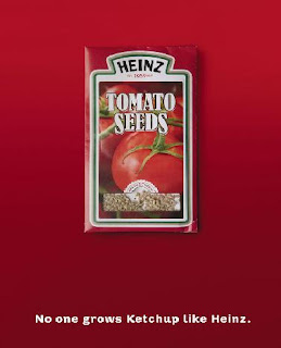
I first saw one of these adverts on a bus shelter. It was the second one. I took photo of it on my phone as a note to put it on my blog as it really caught my attention. Its fairly simple but clever. The tomato ketchup bottle is made out of slices of tomatos, i believe this is meant to represent the fact that ketchup is made of all natural ingredients, which is important in this day and age when people are really concerened with what they are eating. The background is a simple red which links in to the colour of the ketchup and the writing is white to make it stand out. The type face it kept simple so its clear and easy to read, and links in with this natural idea they are trying to get across. ' No one grows ketchup like Heinz' also links in well with this tone of voice.

The other two adverts i found on the internet when researching the first. The top one i think works really well with the tone of voice aswell, as its subtle at pointing the message across. However i dont think the last one works at all, it is far to obvious and doesnt fit in with the other two designs, when u look at them as a series it stands out and doesnt blend in well.

James Downing

James is a friend of mine and is a local artist. He specializes in illustrations, he advertises his work on a website called http://www.couk-art.co.uk/. His home page represents his work very well, shown below:


The page is set out like a book or diary, the left hand side describes who he is and the right allows you to click on other links. The reason it reflects his style so well is that its all hand drawn and looks like sketches or doddles, this is his style. Another reason i like his work is there is no p.c and he gets straight to the point without being posh. An example of this is shown in the writing in this home page where he writes 'where you can see how ruddy amazing my illustrations are.'

Another good example of this and his main work that i really like is his 'clog' which is a comic blog. Its called suede diary. Instead of writing a normal diary in his blog he writes about his day to day life in cartoon form, most of which are very funny, shown below:


I am even in one of these cartoons :D

Friday, 18 July 2008

les Ciencies Complex

A wonderful piece of modern articture in Valencia, Spain

Summer of love and Pimms

I am currently working at a wetherspoons pub in Leeds. At the moment we are trying to sell our 'summer of love' theme where we are trying to push certain summer drinks. This whole camagine is delievered in a number of ways. Including posters around the pub, a display table in the pub, on the wetherspoons website and in the monthly wetherspoons magazine. The website is shown below:


All the ambient media follows the same theme as this website screen shot. The colour of every background is this light blue featuring a hint of clouds. This is typical of summer as it reminds the viewer of bright clean summer skys. The whole campagine with the typeface of the 'summer of love' title and all the bright flowers, has a very 60s feel to it.

This is because the Summer of Love refers to the summer of 1967, when an unprecedented gathering of as many as 100,000 young people converged on the Haight-Ashbury neighborhood of San Francissco, creating a phenomenon of cultural and political rebellion. While 'hippies' also gathered in New York, Los Angeles, Atlanta, Chicago, Vancouver, and across Europe, San Francisco was the epicenter of the hippie revolution, a melting pot of music, psychedelic drugs, sexual freedom, creative expression, and politics. The Summer of Love became a defining moment of the 1960s, as the hippie counterculture movement came into public awareness.

One of the main drinks that the pub is trying to sell is Pimms and lemonade, it is our 'focus drink' of the summer and we are trying to be pushed to sell as much as we can. This is reflected in the fact it is on the front cover on our june/july magazine, shown below:


Agian on this magazine cover you can see the summer of love theme running through.

Pimms is a very well known summer drink, and it uses it advertising very well. Its very common to hear people saying the tag lines such as 'Its pimms o'clock' , 'ten of you one of me i make that pimms o'clock' or 'anyone for pimms' which was made famous by various advertising methods. The website for pimms follows through with this pimms summer theme aswell, shown below:


The background of the website is set in a park theme, you can see a couple blurred laying in the park, they have small movements like they are chatting but no movements to big to distract the viewer. In the right hand corner is a little note saying 'quite please' this is because the website has faint distance sounds of summer in the park, including noises like birds tweating and kids playing. This sets the scene really well. Links at the bottom of the screen include 'sunshine o'clock' and 'in the park'. As you first join the website home page the pimms pitcher is empty but this slowing fills while fruit like strawberrys roll across the scene, a common symbol of summer and things like wimbledon.

The famous pimms o'clock adverts which always end with the '?(a number) of you.....one of me.. i make that pimms o'clock' have been running now for several years. Alexander Armstrong plays the upper class twit with the picnic hamper containing his Pimm's mixing kit. He encounters a variety of different groups including motorway protesters, prostitutes, farmer workers and rave DJ's. One of the most popular adverts was one in a prison, shown below:

In this he is tunnelled into a prison, however the inmates jokingly tell them it's a Holiday Camp. In his usual brashness he has set up his travelling Pimm's case and is barbecuing sausages and making Pimm's for all, the party is ended when the Governor of the Prison chucks him and his case out.

The whole pimms series has been such as success supermarkets put Pimm's and punnets of strawberries on special offer together, and 80,000 half pints are served at Wimbledon every year, closely trailed by race meetings at Royal Ascot, Goodwood and boating at Henley.Also if you're feeling lazy or going on a picnic you can now buy pre-mixed Pimm's No 1 in can form. It is proberly one of the most successful advertising camagines in recent times.

Stop smoking

I felt the need to write about these set of adverts as there have been many stop-smoking campagins over the years, however this most recent angle being explored is targeting parents and playing on there emotions that the children are more likely to start smoking if the parent does, i feel that this is a great new way to campagin. Two of these adverts are shown below:


The esscence of both these adverts is the way they use music to stress there point. In recent times music in adverts has become very popular, which started with the Halifax adverts that have become so well reconized. It is good that the NHS therefore is looking at current trends and trying to incorporate them into there advertising. The music plays over the top the whole time with little narrative (which is only featured at the end of the advert) and relates well to the story that is trying to be portrated. The lyrics are clever and they try to tug on the heartstrings on the parents, it is a shock tatic to try and get parents to think. The I love you song is very catchy and makes you remeber the advert as it gets stuck in your head. However to make it more effective they need to re-edit it with the "I love you" at the end not narrated over to increase the punch.

The lyrics in the 'I love you' song, is sung by a child in a very child like voice. This makes the advert have a better impact then if an adult or the original artist - Shirley Temple - was singing it as its like we see the advert threw the childs eyes, and see first hand the impact smoking can have on them. In the other advert, the music begins to trail of and turn deeper when the child begins to mimic the smoking of her mum, agiain this is to create a deeper impact on the parent watching.

During the advert you dont actually find out that it is about quitting smoking till the very end. However in the I love you song advert it is easier to guess as they use shots of parents smoking the whole time during the advert and even have a close up on a childs toy truck full of cigeratte butts. On the other hand the second advert is showing children mimicing their parents in everyday activities e.g. cooking so the viewer cannot guess that it is going to turn out to be about smoking. This gets the viewer hooked on the advert as they want to find out what its for and even try to guess. The end outcome could be surprising.

Saturday, 12 July 2008

Sweeny Todd


Loved this film! (And it had nothin to do with the fact i got to stare at Johnny depp for ages!)Sweeney Todd is a fictional character who first appeared as one of the protagonists of a penny dreadful serial entitled The String of Pearls (1846-1847).

In this and later versions of the tale he is a barber who murders wealthy customers by pulling a lever while they are in his barber chair which, unknown to them, is fixed to a revolving trap-door, making them fall backward into the basement, generally causing them to break their necks or skulls as they hit the ground. Just in case they are alive, he goes to the basement and "polishes them off", meaning he slits their throats with a cut-throat razor. After Todd has robbed his dead victims of their goods, Mrs. Lovett,his partner in crime (in some later versions, his friend or lover), assists him in disposing of the bodies by having their flesh baked into meat pies, and selling them to the unsuspecting customers of her pie shop, because "times is hard" and she cannot afford the meat. Todd's barber shop is situated at 186 Fleet Street, London, next to St. Dunstan's church, and is connected to Mrs. Lovett's pie shop in nearby Bell Yard by means of an underground passage.

The tale surrounding the character became a staple of Victorian melodrama and a Tony award-winning Broadway musical in 1979. Sweeney Todd has also been featured in several films, the most recent being Sweeney Todd: The Demon Barber of Fleet Street (2007), directed by Tim Burton, with Johnny Depp in the title role.
Claims that Sweeney Todd was a real person are strongly disputed by scholars although there are possible legendary prototypes, arguably making the story of Sweeney Todd an example of an urban legend.


I also went to West yorkshore Playhouse to see a theatre production of this over summer and loved that to! Although Sweeny Todd wasnt as eye catching as Johnny Depp!

Wednesday, 9 July 2008

KFC advert

While i was browsing the interent i saw a link in the msn homepage about controversial adverts, as this is close to the topic i was thinking of doing my dissertation on i was keen to look at what was on there. I was very surprised to learn that the most complained about advert of all time in uk tv history was one by KFC aired in 2005. This advert is shown below;


This advert got 1,671 complaints and it doesn't have sex, violence or bad language. Hundreds of parents were annoyed at the depiction of workers singing with their mouths full. However, the ASA decided that the ad wouldn't undermine the teaching of good manners and the complaints were not upheld. I think this is correct of the ASA to do one comment on you tube sums this up for me brilliantly 'Only in Britain could adverts with nudity and sex references be ok, but one with talking with your mouth full get banned! :p' What do you think?

Chocolat Factory

While looking at other peoples glogs i came accross one (http://cerbear07.blogspot.com/) that had a link to this website http://www.chocolatfactory.com/ and although she commented on its work slightly i felt it could be taken further so i decided to check out the site myself.


The Website


This is the homepage to the actual website, it using a dark background for greater impact with white writing to stand out. The three cicrcles on the right hand side have permant colours in, the others get filled with colours when the mouse moves over it. The colours are all dark browns and beige which relate to the chocolate the company is trying to sell.

The products


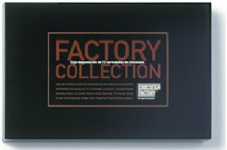
Both of these products one many awards. including Best packaging design2000, Barcelona, Fab awards 2001, London, and Award of Excellence Communication Arts 2001, California. Both packaging are simple but effective. You can also see the link between these designs and the design of the website. Again it has the strong black background for a big impact, this would definatly stand out. It again has the brown chocolatly colour that gives the target market a clue to what the product is actually selling. It also uses the white writing in corrosponding strips in the centre to make the writing stand out.

Simplicity


'Simplicity' by Mark Salmon is a book i have just started to read, the main reason i am currently reading it is because when i first saw it the front cover and the image struck me as it stood out quite alot and i found it intriguing, it made me ask many questions, Who is this person on the cover? Is it the author himself? Perhaps as a child? The face is obscured. A mystery!

I then noticed that the title of the book is askew and it is done in style that makes it look like it has been hand etched. This gives the viewer the impression that the ideas written in the book are maybe unconventional and perhaps shows the relfections of an independant minded author.

Very surrprisingly there is an endorsement on the front of the book. The endorsement is by the lead singer of Christian heavy metal group POD. This would lead us to believe that the author is perhaps himself either a Christian or into heavy metal, or both.

The composition of the book is engaging and friendly. The colors are well balanced and coherent with the title of the book. However i dont like the endorsement on the cover. What do heavy metal rockers know about books? It also seems a little like name dropping. A bold and unconventional move, but ultimately it comes off as little desperate. Over all, it is a good cover and it makes me look forward to reading it.

Rose


I have LOVED these close up rose pictures for a long time, i have just moved house and finally brought my self one for my room :D I think they have a great impact with the strong colour of red and vibrance of the picture. love it.

Tuesday, 8 July 2008

Crimp off

"Crimping" is the singing of short, random songs, which has become a trademark of the 'Mighty Boosh' series, featuring in every episode. The mighty boosh stars Noel Fielding and Julian Barret, the show started on BBC three in 2004 but has since become a massive success resulting in more tv series, live tours, radio shows, an album and appearances at festivials. One of there main sketchs is when they would do a crimp, an example of this is shown below,


Therefore when the new sugar puffs adverts came out, created by Bray Leino, that seemed to be copying this crimping style hundred of boosh fans have kicked off, (including me) as there is no mention of the mighty boosh in the advert. Below is the advert,


On youtube, where i got these clips, people have left comments about this advert being like mighty boosh crimps, one wrote ' This advert is evil. I've been boycotting sugarpuffs since this advert came out.Shocked.AndDisgruntled!!' and another wrote 'can't believe sugar puffs copied the Boosh! it's an outrage!!!!!!!!' So has this damaged sugar puffs? and how have they got away with it?

Noel Fielding and Julian Barratt, are reported to be speaking to lawyers about getting the advert pulled, according to a story in The Sun. Bray Leino, described the advert as a "bizarrely comical musical ritual". He said it was unable to comment on the Boosh fans' claims. A spokesman for the agency said: "As we only created the ad for Sugar Puffs we feel they should be given the chance to answer them as it is their brand that is in the spotlight." However, HM Foods, which makes Sugar Puffs, refused to comment about the similarities between the advert and "crimping".
Information from: http://www.webuser.co.uk/news/199018.html

Although this advert seems to have no clear target market, was its purpose therefore to spark this outrage to get people talking? Sugar puffs is seen as a childrens cereal therefore the people most likely to buy this, and therefore there main customer consumer, would be women aged 20-40 i.e mums, therefore i am not sure if this advert will actually damage the volume of sugar puffs being sold as this isnt the main target audience of mighty boosh and do they really care if the advert is copying it? Even if hundreds of people do?

Julian Bever

Julian Beaver is a artist who specializes in 3D art, he likes to do these drawings in chalk on the street where they are esaily viewed by many and have the biggest impact. He has been doing this for ten years all over the world.

He also does oil paintings and wall murals however it is his 3D work that i find most amazing and inspiring, as i have always been fascinated by the way illusions can work.


This laptop illusion was drawn on the strand in London.

Graffiti - Art or Vandalism?

Graffitti, does it brighten up our surroundings or ruin them? I have many friends who are graffiti artists, and yes i say artists as thats what i believe they are.


My opinon is that there are two types of graffitti, ones that are art and help brighten up areas of our community and those that just ruin it. The two pictures above represent this. The top picture shows graffiti that i believe is vandalism, these are not artists. This sort of graffiti is known as 'tags' and are basically where people just scribble their names. It's messy, it's often offensive, and it costs governments and ordinary people millions of dollars to fix up every year


The other picture shows true graffiti. In some cities there are places where walls have actually become open air galleries. But it's often hard for graffiti artists to find a place to work legally. That's why some authorities have started to work with them. They're realising that if it's done properly, everybody wins. In America there is a project called Aerosol Art, its a group for children to join and help create grafetti art in run down areas. One piece of work they done was on a railway bridge it used to be covered with illegal graffiti and the council spent about 75,000 dollars a year cleaning it. But since the murals went up, there's been hardly any tagging and if the people in it are caught doing any illegal graffiti they'll be thrown off the team. Below is the railway bridge they done:


This graffiti style is used in media for advertising and on a range of brand products. For example in the picture below graffiti is used on these drink cans.


The drink is called The All City "NRG" drink, made by AriZona Beverage Co.

Club flyers - Play on words

I love s.e.x is a student night in Leeds. It has been running for about three years and in this time it has moved from Evolution nightclub, to NU Bar and is currently being held in Bajas. Although it has had several homes, the advertising for this night club has remained similar, shown below.


The name of the student night is a pun, its a play on words as s.e.x actually stands for Saturday Evolution Experience, or Saturday Entertainment Experience, therefore its also very tongue-in-cheek. Doing this grabs peoples (espically students) attention who may be walking past posters or given leaflets on the streets which is the main ways this sort of night is currently advertised.

Keeping the name and layout the same makes it instantly recongizable to people who are already familiar with and like the night so they keep the same customers while still gaining new ones.