The Website

This is the homepage to the actual website, it using a dark background for greater impact with white writing to stand out. The three cicrcles on the right hand side have permant colours in, the others get filled with colours when the mouse moves over it. The colours are all dark browns and beige which relate to the chocolate the company is trying to sell.
The products

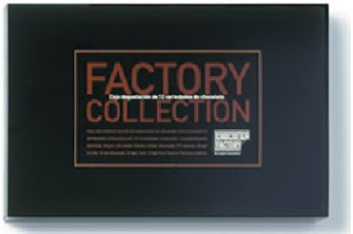 Both of these products one many awards. including Best packaging design2000, Barcelona, Fab awards 2001, London, and Award of Excellence Communication Arts 2001, California. Both packaging are simple but effective. You can also see the link between these designs and the design of the website. Again it has the strong black background for a big impact, this would definatly stand out. It again has the brown chocolatly colour that gives the target market a clue to what the product is actually selling. It also uses the white writing in corrosponding strips in the centre to make the writing stand out.
No comments:
Post a Comment